Tuesday 16 May 2017

Research and planning - advert: Drafts of adverts

After analysing key elements that help in the creation of a successful advert. We started to look at creating our advert for the work we was producing, as having an advert is really important in the promotion of an album, and also a key form of synergy. Therefore it is necessary to create an advert that appeals to the audience, as well as being relevant to the genre and consistent with the digipak.

Draft 1

Analyse your use of conventions using PEER:
  • An image of the main artist has been included, however he is not facing the camera and instead stares down at the floor. Our camera-operator captured this using a long shot, with the intention of the artist looking mysterious, with the use of low-key lighting.
  • Key information has been included in the advert to prevent the confusion of audiences
  • The typography used is conventional to the genre, slick and adventurous
Audience Feedback:
  • Even with having a dark background the advert stands out, the font is bold and easy to read, and all they key details of the record label, artist name and album title is there. 
  • Where the music can be downloaded should be included
  • The artist placing on the cover needs to be fixed as it is obvious and clear that it has been photo-shopped

Draft 2

Analyse your use of conventions using PEER:
  • A few changes were made to improve the quality of the advert to keep the consistency of it
  • We added important information, such as where to download the album
  • The shade of the background was made darker, to increase the gloom feeling around the album as we had hoped for, something we saw as a 'don't judge a book by its cover' sort of feel with the campaign.

Audience Feedback:
  • Looks far better than the other draft, as it says 'Available on Spotify' at the bottom, so now I know I can find it on Spotify
  • The colours from the first draft, stayed consistent and remained on the second draft for efficiency
  • The white spotting seen in the first draft isn't as visible and has been removed. 

Conclusion
The drafting process has allowed us to create an advert that we have deemed as a group, as acceptable to the audience and with us receiving feedback, this has allowed us to go back to the drawing board and improve on the original design. It is important that we are able to receive feedback from the target audience, and also for the hip-hop industry to gather feedback using our campaign, in turn helping them to understand what is important to the audience and how they can target their specified audience effectively and efficiently.

Research and planning - advert: Identifying conventions and analysing existing adverts

The purpose of an advert:

  • Including key information about the release dates to keep the audience aware
  • A generic form of synergy
  • A way to promote the artist
  • To appeal to the music industry and in turn become more noticeable, linked with promoting artist but on a wider scale


Generic conventions within an advert:

  • Album title
  • Artist name
  • Release date
  • Important, popular singles
  • Where it can be streamed
  • PA logo in the case that there is explicit content


Example - Adele - 21


Main artist: The main artist is meant to be the centre of attention within the advert. The advert is the promotion of the artist rather than the album, this can be done through the close-up of the artist revealing Adele to the audience. 

Lighting and Colour: The use of a backlighting and low-key lighting allows the artist to stand out more. Additionally, the use of black and white as a shade allows the artist to stand out and helps convey a message that there is a gloomy theme aimed at the audience.

Typography: The font is quite simple, however, it also stands out amongst the dark background as the text is in white and a dark shade of lime green. 

Information: The advert only has relevant information and isn't overly detailed as well. The advert only tells key information which is the artist name, album title and shows an image of the artist.

Layout: The layout itself is quite simple with the artist and the album title at the top, with 'Adele' centered next to it, closer to the album title. Also, note that the artist and album name are right next to eachother, making it 'Adele21'. The layout is designed to appeal to the audience and being simple as possible helps the advertisement to be more efficient and effective.

Hebdige Subcultures: The advert is conventional and is an indication of Popular Culture, rather than niche subcultures. However, because of the presentation of the adverts, there are hints that some of the singles included may subvert conventional Pop, something that can appeal to subculture audiences.

Our planned ideas:

  • Keep the layout simple, as it is basically appealing to the audience
  • Keep the information basic and minimal, however, at a level high enough to ensure the relevant information is included
  • Typography will need to be clear, and understood
  • Conventional and a visual appeal to the masses

Monday 15 May 2017

Final product: Digipak

Our group complete with a finalised magazine advert and final product came to the conclusion as to how we are going to come about with our Digi-Pak, discussing the design and the direction we wanted to take, and whether we would use it to give the artist an outstanding image, or go for the mainstream approach with the hip-hop genre of making it an image containing a deeper message.

Front Cover 
This was the front cover, as we felt as if the posture of the artist in this front cover matched the name of the album, allowing the audience to feel sympathetic as to what the artist could possibly mean by being 'tied to life'. 

Interior/CD cover
This was the interior design for the CD cover, a little quotation from the artist himself was added as we felt it would reach out more to those who were looking on the downside of life and could use that message to pick themselves up.

Rear Cover
This was the rear design of the digipak, and we had the impression that if we started with the main song on the artists EP, it would gain the attention of the target audience, and put one of the best or fans favourite near, or at the end, it would entice the audience and encourage them to listen to the whole album in order to experience and listen to each song. 


Final Product: Magazine Advert

This is the final advert our group has come to the conclusion to use for our final product music video, as a means to promote the product and gather support for the artist, generating a fan base as we had hoped and allowing the audience to recognise the artist based on their current art form.


Final product: Music Video

After working behind scenes and undergoing what was necessary to create this music video, we have come up with a final product. Taken into consideration every little detail from cinematography, to star image and theories.


https://drive.google.com/open?id=0B19beI_O9BkBN2Z0c3VEb1dkVU0

Planning: Locations

Location is a very important factor to consider in music video during pre-production, as the locations in our music video will be chosen to fit the themes and purpose. We have decided on the final locations using the plans from our storyboard and risk assessment. The main focus was to have a variety of locations/settings for the final music video, further based on the feedback from our questionnaire.

Location 1: Stratford/ Westfield


Relevance to lyrics: It relates to the lyrics in a way as the way he says, "I got my city doing front flips", with the filming of it in a busy area showing the audience that the character is in a 'city', and even "Clean up the streets so my daughter can have somewhere to play", has relevance to the setting as Westfield is clearly a busy area with a mass amount of people going there everyday to shop.

Relevance to genre: In terms of modern hip-hop it is not relevant, but by filming in a empty area rather than a busy environment it is ideal to show this jump from being a mainstream video to a niche one. 

Relevance to target audience: Areas may be familiar to the audience leading to them getting rather excited as to the fact that they know these areas and have been there, also it gives audiences an insight into areas they may never have been as it may appeal to them as a place to go.

Advantages of location: The buildings around the area are familiar, however we filmed in a closed off part of the area, so there are no disturbances. We did however film some parts in an area where people would walk past and acknowledge your presence within the area.

Potential problems and how you could overcome them: The area is busy every single day as there are thousands of shops in the area, appealing to different age groups and individuals, however, Sunday is the least busiest meaning that we could film on the day. 

Existing video that influenced this location:
Chance the Rapper - Angels - areas set around Chicago
T.I. ft B.O.B and Kendrick Lamar - Memories Back Then - areas set around Los Angeles, California

Location 2: Ponders End Car Park


Relevance to lyrics: It has no relation to the lyrics apart from one verse which speaks, "It's too many young n****s on the southside, got us scared to let our grandmommas outside", the word 'outside' is the only known subtle link as our character will be performing and dancing outside.

Relevance to genre: The location is irrelevant to the genre and more to other genres, meaning we have avoided the mainstream and gone for the niche pathway. 

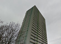
Relevance to target audience: The area may be familiar to the target audience as the block of flats behind the character could be where some of them live, also the area of Ponders End could be a known region to a majority of the audience as the scene is a local area. 

Advantage of location: It is easy to get to and doesn't necessarily require permission to be filmed in due to its short gap between it and the academy. It is a large area and can be explored to film different parts of the song without the audience knowing if we have moved or not, allowing them to analyse our imagination and creativity. 

Potential problems and how you will overcome them: Since it is centered around a car park, it is possible that cars could be coming and going, making it incredibly difficult. 

Existing videos that influenced this location:
Major Lazer ft Travis Scott, 2Chainz, Mad Cobra and Pusha T - Night Riders
Dr Kucho and Gregor Salto x Ane Brun - Can't Stop Playing

Planning: Copyright letter

After choosing the final song for the group, it was imperative to gain permission from the copyright holder before we could proceed in producing our music video. There was the possibility that our music video could be taken down, leading to a range of issues as it is considered illegal to the content of someone else without permission from the copyright holder. This means that we would be required to send a letter asking for permission to use the specified song in our final product, this will also be sent via email to the copyright holder.

Copyright Letter
The copyright letter that was written, has directed asked the artist for permission as they don't have a known management team, and is not signed to a record label/company. We have included the purpose of the letter, and an explanation as to our intentions of the song, including the upload of the final video to YouTube.

https://mail.google.com/mail/u/0/#search/elliott/15a139fa6237c2d6?projector=1